How a minimalist color scheme can be cozy

Normally, when I think of minimalism, I think of angular lines and chrome, which is probably neither a complete nor fair definition. Cozy would not have been the first adjective I would use.

Yet, when the world turns topsy-turvy as it has in the past year, people begin to think differently about what makes a cozy home. In COVID-19 polluted world, the idea of living in a space that’s free of excess—one that fosters a sense of calm—has become more appealing to homeowners.

One of the hallmarks of minimalist home design is a monochromic color scheme, and even though I’m not a fan of minimalism (at least in home design), I can wholeheartedly endorse a monochromatic color scheme.

It’s one way to reduce visual clutter, Kelle Dame of Kelle Dame Interiors in Kenosha told the Milwaukee Journal-Sentinel recently. Lowering the color contrast can result in a clean look as opposed to contrast which creates energy, tension and stimulation.

I’ve chosen paint colors for two homes in the past three years and went with monochromatic colors in both, and I can attest to the calming nature of a clean look.

In every other house I’d owned, I (or my husband) painted every room a different color mostly because that’s what everyone does, especially in cardboard box-type houses when paint color was usually the most distinctive design feature of the room. But in the chome, I had all kinds of other distinctive features vying for attention—etched windows, high ceilings, a dramatic spiral stairway and original wood floors. I decided I didn’t need a bunch of different paint colors muddying up the canvas. I had every room painted in the same colors to create a cohesive backdrop to everything else going on.
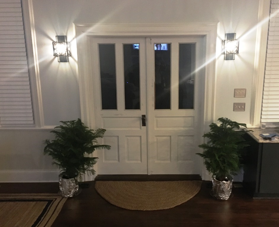
  • For the walls, I chose a light gray inspired by Behr’s Evening White but mixed by Sherwin-Williams. It makes me happy just walking through the rooms any time of day.
  • The trim, a white inspired by Behr’s Bleached Linen, pops against the gray.
  • And the wainscoting, a tan inspired by Behr’s Arid Landscape, brings warmth to the scene (and also is reminiscent of the color it was originally painted).
  • Most of the ceilings in the church are painted in Behr’s Sleek White in eggshell.

More recently, we repainted our condo in Texas.

After painting the entire church in one color scheme, I knew I would do that again in this condo. I decided to switch the dark and light of the original condo paint job by painting the thick, beautiful trim a darker color than the walls. This had the added benefit of saving money on the paint job because we had the ceilings painted the same light color as the walls.

  • I adore the is-it-gray?-is-it-green? vibe of the trim color, called Sensible Hue from Sherwin-Williams Nurturer collection. It calls attention to the most interesting architectural elements of the room—the doors and windows. And the windows become beautiful frames for the view of the lake.
  • A darker color on the wainscoting is Illusive Green.
  • The walls and ceilings were painted in Oyster White.

As a lake home, the condo needed a calm and watery theme (rather than Spanish Revival or whatever was going on before). These paint colors coordinate with the blues and greens of the furniture and accessories we invested in.

How to amp up the coziness value? When monochromatic colors are used, such as whites, creams and other neutral colors, texture will boost coziness, that Kenosha designer Kelle Dame says.

I did that in both homes with jute rugs, baskets, fuzzy throws and textured pillows.

At the church, I mix textures of natural wood, jute rugs, glass and metals.
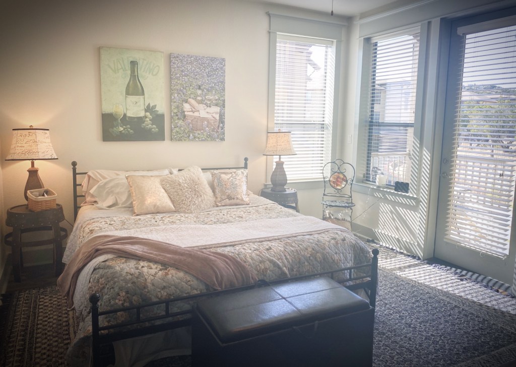
At the condo, I recently invested in all new bedding, including throw pillows that sport shiny, furry and sequined textures.

An added benefit of going monochromatic throughout an entire home is that it eliminates constant decision making. Once you decide on a scheme, every room is the same. Easy-peasy. And a homeowner needs to save only a few cans of paint in the basement or utility closet for touch-ups.

There’s not a day that goes by that I don’t admire the paint job in our home. Someday, I expect I’ll go in a completely different direction, but for right now, monochromatic gives me peace and comfort.
There’s a new place for tree’s home for the holidays

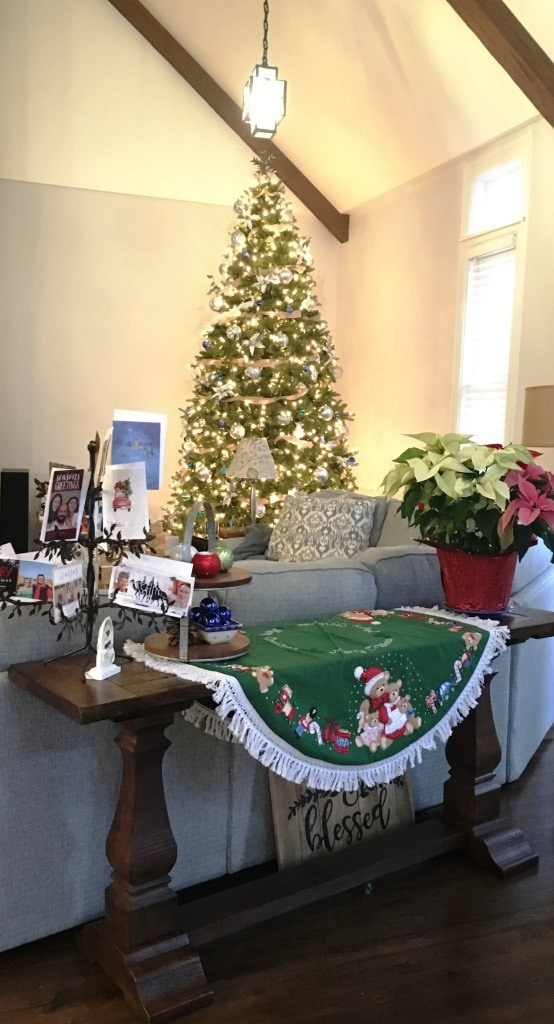
When you have an open floor plan and 20-foot ceilings, you have choices. Like where to situate the Christmas tree.

table clothLast year, we erected our brand new 12-foot Christmas in the front corner of the church, mostly because that corner was still unfinished at that point, and a tree filled the empty space. Putting up a 12-foot artificial tree took some effort (which I recount here), but it was lovely.
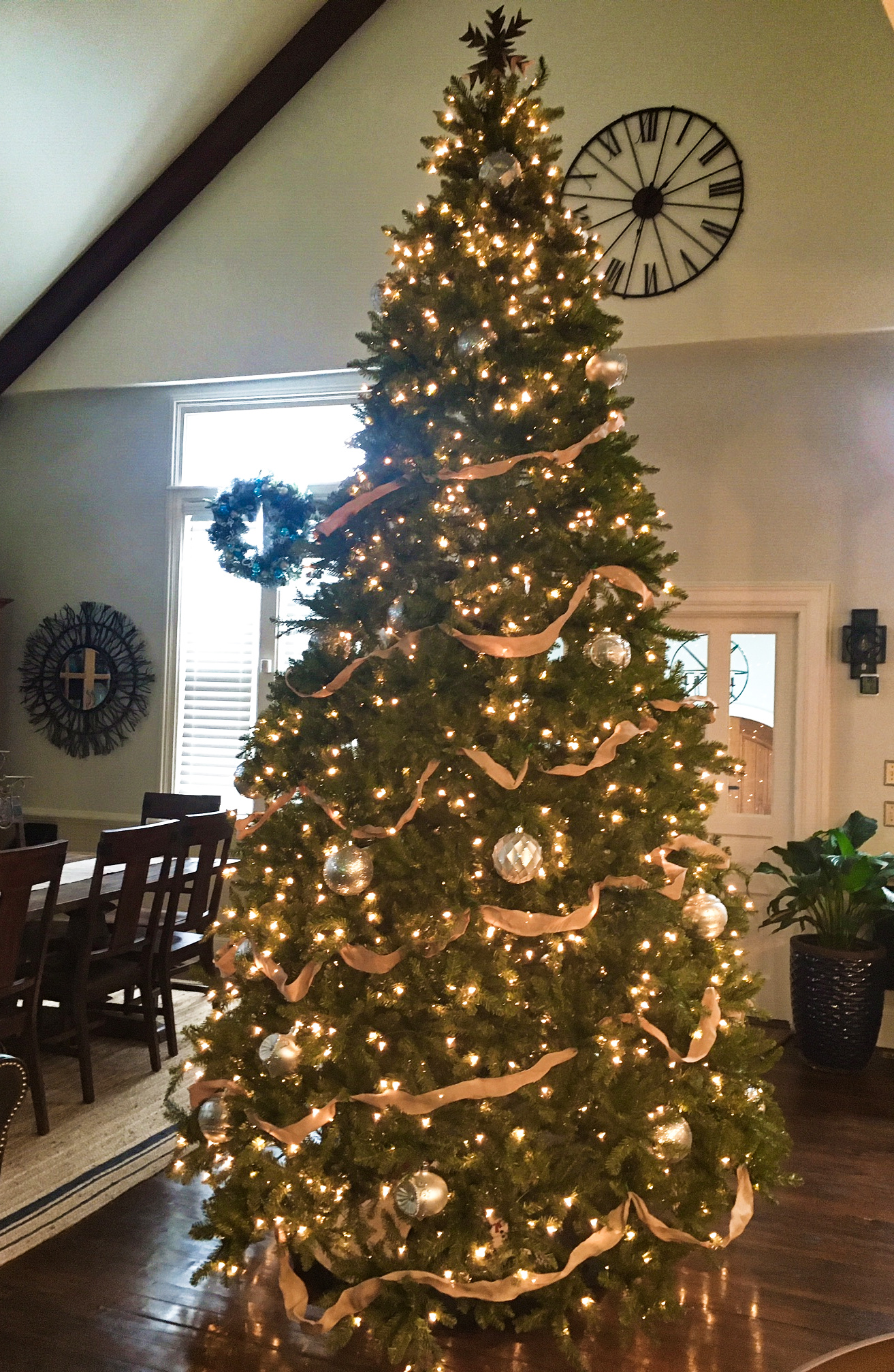
This year, I dug the five pieces of the tree from out under the eaves on the second floor, drafted a little help (St. Johnny) to get the pieces to the main floor, and the three of us reconstructed the tree in the back of the church at the entryway.

Since last Christmas, that front corner got new built-ins and we put the barrel-top desk there. No room for a tree. But there was a big open space in front of the double doors of the entry, and as long as we kept the Christmas star away from the ceiling fan, there was plenty of space to fill.

Once assembled, I spent a hour fluffing the boughs that were crushed in storage and another hour trying to figure out why one row of lights didn’t work, but all was put right in the end.

Christmas tree editted

Ta, da!

Now we can walk all the way around the tree (which is a first for any Christmas tree I’ve ever decorated inside a house), but that just leaves more room for gifts.

I hope you are finding newness and joy rather than drudgery in your holiday preparations. Here’s to a blessed season of Advent.


Wherever an altar is found, there civilization exists

Preparing pictures for the Hall of History has been challenging, but I am reveling in a recent triumph.

The Hall of History, you regular readers might recall, is the hallway between the great room and the master suite. We left the flooring rustic and installed original milk lights from elsewhere in the church for lighting. The walls will, one day, be covered with historical photos of the church and our families. I’ve been gathering bits and pieces from my own collection to frame, but it’s slow work. I spent an entire afternoon recently visiting local libraries and museums looking for historical photos of the church and came up with nothing.

However, a former member of the church gifted us with a pile of photos of the church from her archive, and one of them was an image of the last pastor teaching a lesson for vacation Bible school from the front of the church. It was a great representation of the altar area when it was in use.

I paired the photo with a brass plate given to me by an interested party who salvaged it when she saw the altar on the curb as the congregation was preparing our church to be vacated. She was a little sad to see the altar disposed of in this manner but she couldn’t save the altar, so she saved the dedication plate. She made me promise to do something respectful with it.

HOH image closeup
The brass plate here was once attached to the altar in our church.

August F. Esch was presumably a pillar of the old Methodist church in the early 20th century, I’m guessing. The story I’ve made up in my mind is that his family chose to subsidize a new altar that was installed in the church when the orientation of the front of the worship area was moved from the east side to the north side in the 1940s.

I brought the photo, the brass plate and a brief explanation of the pieces to Michaels framing department to have it professionally displayed. I chose a simple black frame to match the other frames I have planned for the Hall of History. The resulting whole was definitely greater than a sum of the parts.

Hall of History image
The final result. How civilized.

My next step is to visit the county courthouse and spend some time in the abstract office to see what the official record says about the construction of the church and the property on which it sits. Wish me luck!

# # #

Today’s headline is a quote from Joseph de Maistre, a philosopher during the French Revolution.


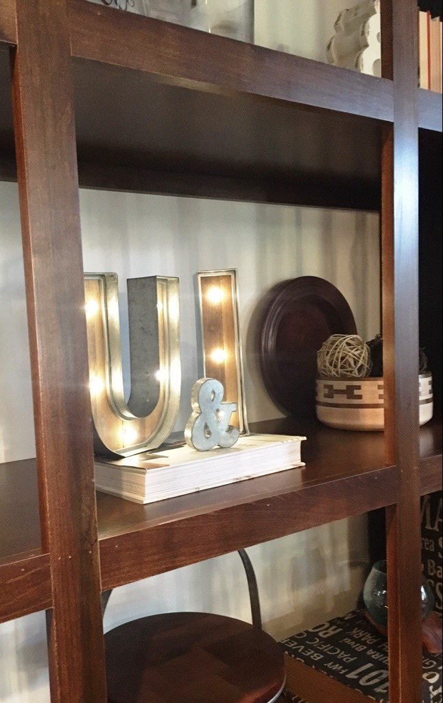
& U … light up my life

There are two kinds of people in the world: The kind who brag about how much they spent on something and the kind who tell you about the great deal they scored.

If you haven’t figured out by now, what with our frequent trips across country to pick up Craig’s List finds and our limitless willingness to piece together weird parts for a greater whole in our converted church, we’re the second kind. “Look at this amazing deal!”

For me anyway, I think it’s my Minnesota roots via Scandinavia. It’s common to compliment a Minnesota woman on her becoming frock and hear about the size of its discount on the clearance rack.

So, let me just say, “Guess how much this cost?!”

u-and-i.jpg

[Waiting expectantly for a low guess. But not too low. I want to wow you.]

Only 5 bucks!

I know, right?

As I mined the clearance racks at the various home stores I frequent looking for interesting tchotchkes with which to style my shelves and tables, I found this lighted rustic I and U. Apparently, little baby Ulysseses and Ingaborgs are rare so mommas decorating their baby rooms passed over these gems. The only other letter on the rack was a D, and who wants a DUI? They had the perfect shabby modern look I’m going for in Church Sweet Home. They were only a dollar each (batteries not included).

To me, they weren’t lonely letters but a statement about me and my hubby: U & I.

U & I!

All I needed was the ampersand.

I love ampersands. They are so much more interesting that the word and.

So I cruised the craft store until I found a galvanized ampersand for only $2.95!

I was so pleased.

When I got home, I assembled my little statement on the shelf at the front of our sanctuary. I flipped the switch and ta, da! Instant glamour and romance.

What a deal!

u-and-i-in-context.jpg

Decorating the church for Christmas

More than a year ago, when we were trying to convince our loved ones we weren’t crazy for wanting to live in a church, I told my stepdaughter she should get on board because she would love the 18-foot Christmas tree we would put in the great room.

Well, it’s Christmastime, and we’re wanting to make good on our promises, but as it turns out 18-foot Christmas trees aren’t sold off the shelf at Home Depot. Or anywhere else for that matter.

Early last week, I stopped at Wal-Mart, Home Depot, Meijer’s, Hobby Lobby, Michael’s, Pier 1, Kohl’s and Bed, Bath & Beyond looking for a big enough artificial Christmas tree suitable for our Church Sweet Home. Nope, na da, no, nix, nope, nope, nope, no.

Most people buy six-foot Christmas trees. Sometimes 7.5 or 8 feet tall. I found a 9-foot pencil tree at Home Depot. That was the biggest. But not quite big enough. We’d ruled out the 18-foot model; it turns out 12-feet tall (plus a star topper) would do in the corner where the ceilings were lower.

So once again, Tyler turned to the internet. We found a 12-foot Christmas tree on Wayfair that could be delivered in two days. And I had a coupon. Click, click, click, and we were the proud new owners of a Christmas tree with 7,480 tips that came in five parts.

If you thought finding a 12-foot tree was the hard part, you’d be wrong.

Try assembling a 12-foot Christmas tree. It took both of us three hours to fluff all those wiry tips. And we summoned You-Can-Call-Me-Al, who was staining our entryway steps, to stack Part VI on Part III of the tree (Part V was light enough for me to stack from the top of a 10-foot ladder). Fortunately, all the of lights worked when we were done.

This slideshow requires JavaScript.

I also needed the ladder to decorate the tree. But I got my workout in going up and down those rungs. Tyler helped hang 100 feet of ribbon, and I used four boxes of large silver ornaments, 18 white poinsettia blossoms, two feathery angels, one white peacock and every last white, silver, gold, blue and aquamarine ornament we owned or I could scavenge.

christmas tree decorated

christmas giftsAt the foot of the tree, all my Christmas gifts are wrapped in snowflake-accented craft paper with white ribbon. Instead of bows, I’m recycling a box of Christmas ornaments we unearthed when we demoed the church.
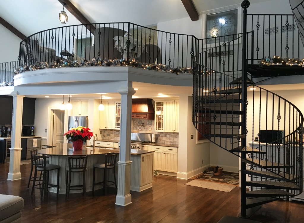
garland

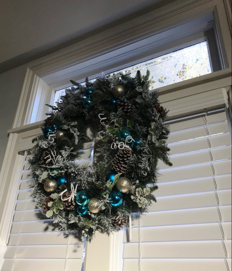
wreath 1I also hung dozens of feet of lighted flocked garland at the feet of our balcony railing. Really happy with the effect. We hung wreaths in front of all the double windows in the great room. Like the tree, the garland and wreaths are accented with silver, gold and aquamarine Christmas ornaments. I’m just a little bit obsessed with flocking and glitter this year.

wreaths

Just when I thought I was finished decorating for Christmas, a new friend stopped by with one more Christmas decoration that, in a way, originated in our church. I’ll try share that with you later this week.


How to create a style guide for your home remodeling project

Our story so far: My husband Tyler and I bought an old Methodist church to renovate into our home, and after the lion’s share of interior demolition to create a blank slate, we are faced with ten thousand decisions about finishes.

# # #

Up until I turned 50, I was happy to let my first husband decorate the house during my first marriage, and then with Tyler, we literally outfitted the first home we purchased together in the space of six weeks by shopping mostly at big-box stores. We were busy people then, and raising a teenager was our priority.

Now, as I pondered the design of our new home, I decided a vision board was in order. The array of options on display at Home Depot, Overstock.com, lighting stores and the various architectural salvage warehouses we visited overwhelmed us. We needed a method of narrowing down our options so we could actually make decisions when the time came. While Tyler pondered ways to install plumbing and electrical when we began our project, I meditated on the finishing details.

I began with my tool of choice: Words.

When I was a brand manager for a major scrapbooking company some two decades before, I had created style guides for logo use, brochure creation and scrapbook page design. These guides helped far-flung marketers and designers all over the world adhere to a coherent brand message about the company’s products. So I drew on that experience to write a style guide for our new house that would help Tyler and I create a home with a unified design.

First, I channeled my inner Joanna Gaines. She was the design guru behind HGTV’s “Fixer Upper” who managed to infuse her modern farmhouse spaces with clean lines, airy color palettes and recycled shiplap. Her “less is more” attitude inspired me, and her home design jibed with the way I had learned to design newspaper pages back when I was a newspaper copy editor: Form follows function. This principle says the shape of something (a building or a brochure or whatever) should be primarily related to its intended function or purpose. In other words, regarding architecture, don’t design a ballroom for a couch potato, and do build bookshelves for a bibliophile.

Then I invested in an armload of home decorating magazines and spent hours flipping through ideas on Pinterest [I have a Church Sweet Home board on Pinterest you can follow if you’re interested—just click on the Pinterest logo in the right column].

With my concepts in mind, I interviewed Tyler. After all, he was going to live here, too. A focus group is simple to assemble when there are only two people in the group. I asked him questions like “How do you want your kitchen to look?” “How to you want to feel when you walk in the front door?” “What colors do you hate?” and “What one word would you use to describe your style?”

Then I put pen to paper (fingers to keyboard, actually), and began.

# # #

Tomorrow: The mission statement of our home style. Read it here.